Ceati
Logo Design
Overview
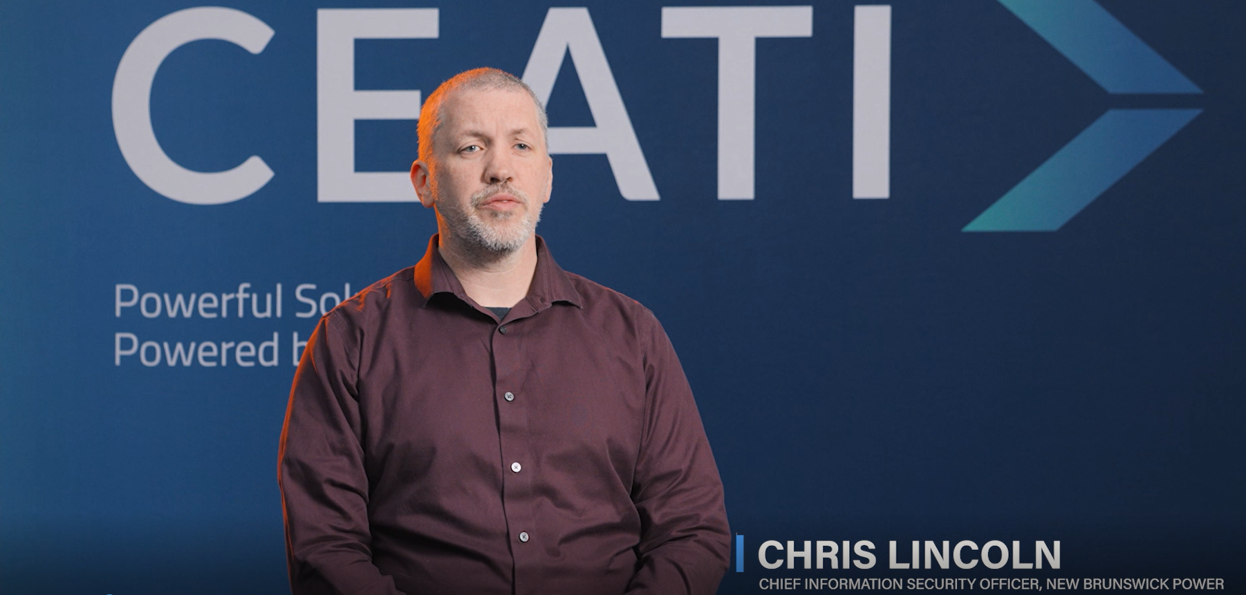
CEATI partnered with our team to refresh their brand and website, with a focus on evolving the visual identity without losing what made it recognizable. As part of the broader refresh, I led the logo redesign, creating a mark that felt modern while remaining connected to the existing brand.
Challenge
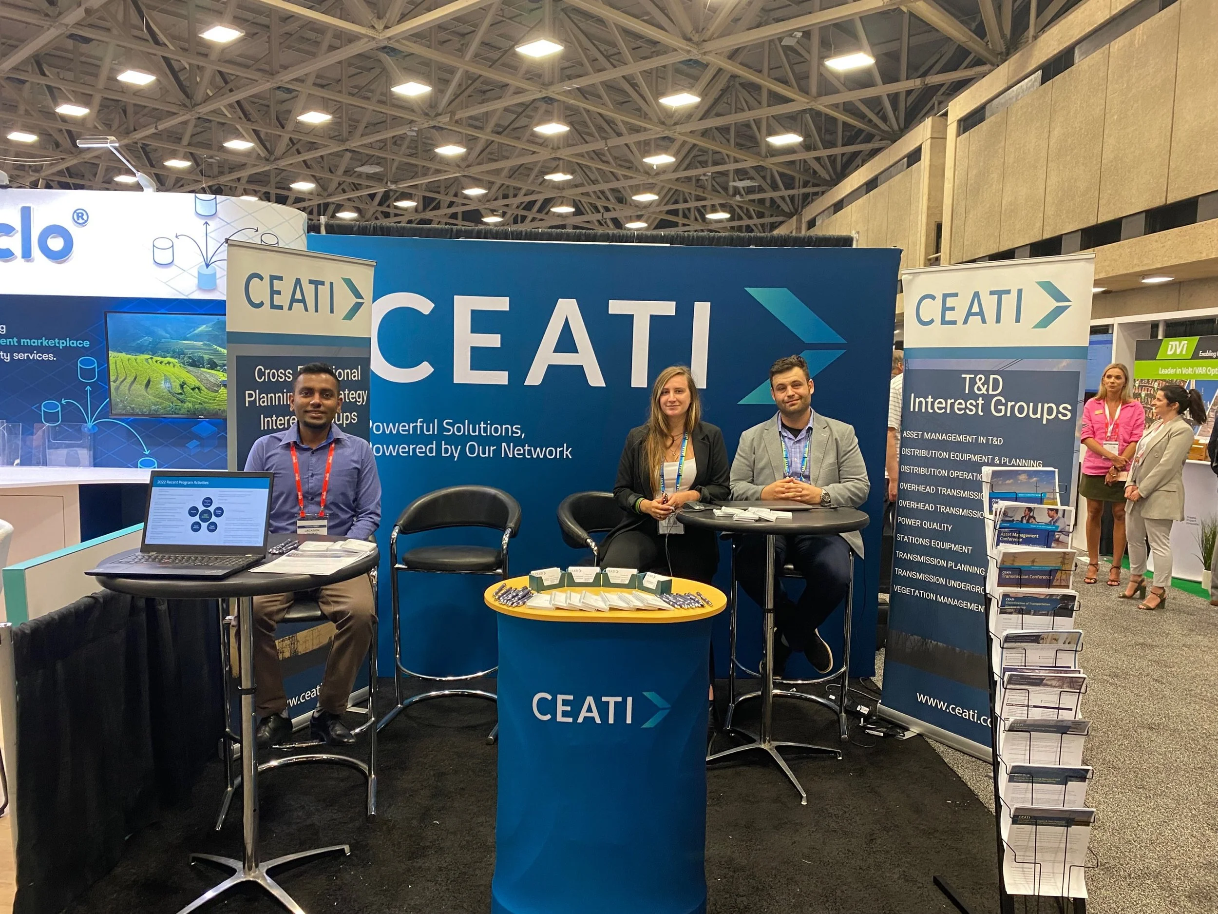
CEATI wanted a logo that felt like a natural evolution rather than a departure. The challenge was to modernize the mark while preserving brand equity and ensuring it could scale across digital, print, and physical environments, including conference booths and large-format applications.
Approach & Outcome
The work focused on refinement over reinvention. Building from elements of the existing logo allowed the new design to feel familiar yet refreshed. Gradients were introduced to add depth and energy, subtly referencing CEATI’s connection to the power industry and their role in supporting collaboration and innovation.
Through iterative exploration, the final logo balanced clarity, flexibility, and modernity, integrating seamlessly into the broader brand refresh. The updated mark now performs consistently across web, marketing materials, and real-world applications, reinforcing CEATI’s identity across every touchpoint.
Deliverables
Logo concept exploration
Final logo design
Color and gradient exploration
Scalable logo applications for digital and physical use
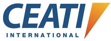
Previous Logo

Updated logo